Time Widget
Main Functionality: In the component editing widget, after selecting the Time Widget, the following are the main functionalities of that component:
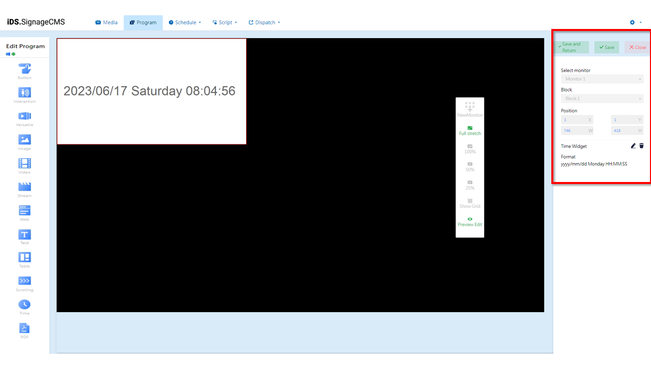
- Select monitor: If multiple screens are available, you can choose the placement areas for each screen.
- Block: The currently selected block.
- Position: You can adjust the position and dimensions of the selected area as needed.
- Time Widger: Provides editing and deletion functions.
 Edit: Clicking on this option will allow you to enter the editing page.
 Delete: You need to first select the component and then click on the delete option to remove the component.
- Edit Playlist
- Format: Displays the time formatting settings.You can choose the display format for date, day of the week, and time to meet your requirements.
- Color: You can customize the Background, Transparent Background , and Text Color to make the content more vivid and prominent. Font: You can choose different Fonts and Sizes within Windows to add a personalized touch to the content.
Text Widget
Main Functionality: In the component editing widget, after selecting the Text Widget, the following are the main functionalities of that component:
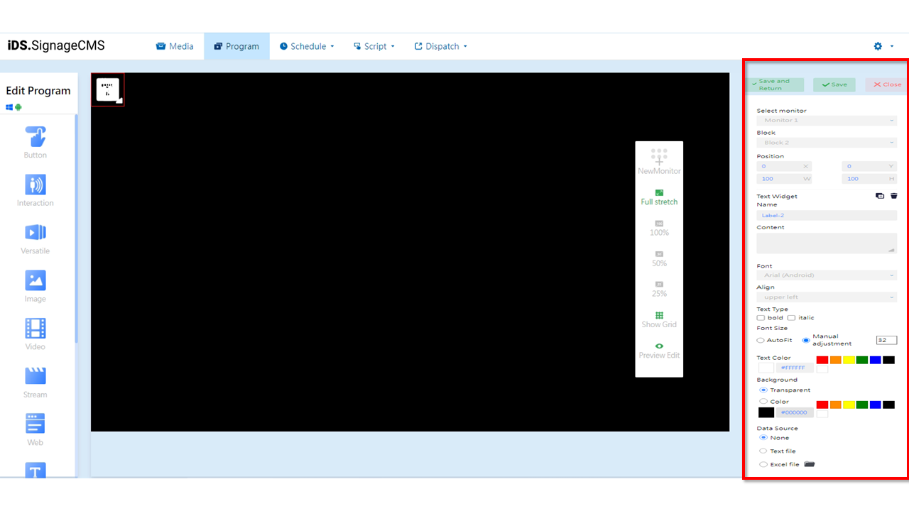
- Select monitor: If multiple screens are available, you can choose the placement areas for each screen.
- Block: The currently selected block.
- Position: You can adjust the position and dimensions of the selected area as needed.
- Text Widger: Provides functions for copying and deletion.
 Copy: You can copy the selected component. The copied component will have the same dimensions and content as the original section/component, and its position will be at the top-left corner with coordinates (X=0, Y=0).
- Delete: You need to first select the component and then click on the delete option to remove the component.
- Name: You can set the name of the section.
- Content: Set the text to be displayed.
- Font: Set the font for the text.
- Align: Set the alignment of the text.
- Text Type: Provides options for bold and italic formatting.
- Font Size: Provides options for AutoFit or Manual adjustment.
- Automatic Adjustment: Automatically adjusts the font size based on the section's dimensions.
- Manual Adjustment: Manually specifies the font size.
- Text Color: You can choose from common colors, use HEX color codes, or use the color picker to select a custom color.
- Background: You can choose from common colors, use HEX color codes, or use the color picker to select a custom background color.
- Data Source: You can choose between None, plain text file (TXT), and Excel file (XLS). > Note: > - After importing an Excel file, please select the sheet name, columns, and rows to display. > - Using Excel files requires the installation of Microsoft Office software.
Table Widget
Main Functionality: In the component editing Widget, after selecting the Table Widget, the following are the main functionalities of that component:
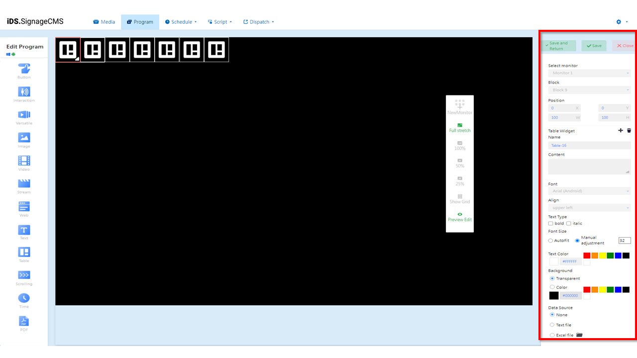
- Select monitor: If multiple screens are available, you can choose the placement areas for each screen.
- Block: The currently selected block.
- Position: You can adjust the position and dimensions of the selected area as needed.
- Text Widget: Provides functions for New and Remove rows.
- Name: You can set the name of the section.
- Content: Set the text to be displayed.
- Font: Set the font for the text.
- Align: Set the alignment of the text.
- Text Type: Provides options for bold and italic formatting.
- Font Size: Provides options for AutoFit or Manual adjustment.
- Automatic Adjustment: Automatically adjusts the font size based on the section's dimensions.
- Manual Adjustment: Manually specifies the font size.
- Text Color: You can choose from common colors, use HEX color codes, or use the color picker to select a custom text color.
- Background: You can choose from common colors, use HEX color codes, or use the color picker to select a custom background color.
- Data Source: You can choose between None, plain text file (TXT), and Excel file (XLS).
> Note: >- After importing an Excel file, please select the sheet name, columns, and rows to display. >- Using Excel files requires the installation of Microsoft Office software.
Below is an explanation of the editing page functionalities:
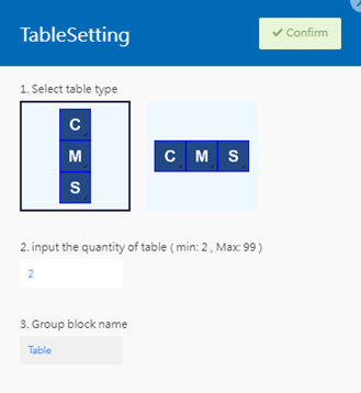
- Select table type: Provides options for vertical and horizontal layout.
- input the quantity of table: Minimum value is 2, maximum value is 99.
- input the quantity of table: You can customize the name.
Scrolling Widget
Main Functionality: In the component editing widget, after selecting the Scrolling Widget, the following are the main functionalities of that component:
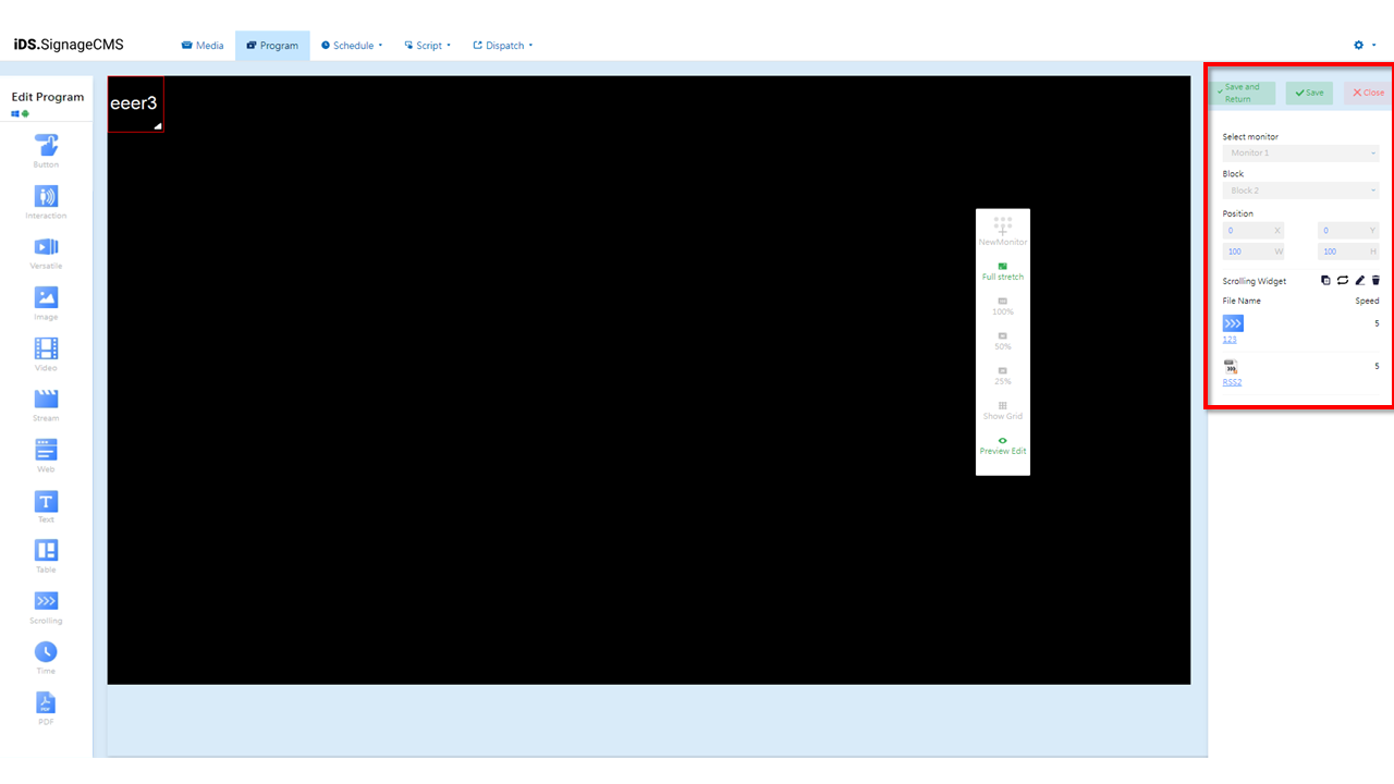
- Select monitor: If multiple screens are available, you can choose the placement areas for each screen.
- Block: The currently selected block.
- Position: You can adjust the position and dimensions of the selected area as needed.
- Scrolling Widger: Provides options to copy the section, set playback mode (sequential or random), edit, and delete.
- Copy: You can duplicate the selected component. The duplicated component will have the same dimensions and content as the original section/component, and its position will be at the top-left corner with coordinates (X=0, Y=0).
 Playback Mode: Offers options for sequential loop or random playback. Clicking on the icon can toggle between sequential and random playback
 .
.- Edit: Clicking on this option allows you to enter the editing page.
- Delete: You need to first select the component and then click on the delete option to remove the component.
- File Name: Displays the name of the imported file.
- Speed: Displays the playback speed of the file.
- Below is an explanation of the editing page functionalities:
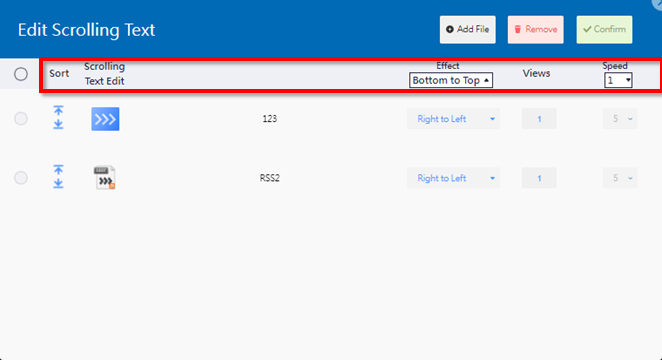
- Sort: Allows you to adjust the playback sequence of the imported files.
- Scrolling Text Edit: Displays the name of the imported file.
- Effect: You can set the marquee effect to move the text from bottom to top, top to bottom, left to right, or right to left, depending on your preference.
- Views: You can adjust the number of times the marquee will loop and play. For example, setting it to 1 means it will play once and then stop.
- Speed: You can set the speed of the marquee's movement, ranging from level 1 to 10, where higher numbers indicate faster movement.
PDF Widget
Main Functionality: In the component editing widget, after selecting the PDF widget, the following are the main functionalities of that component:
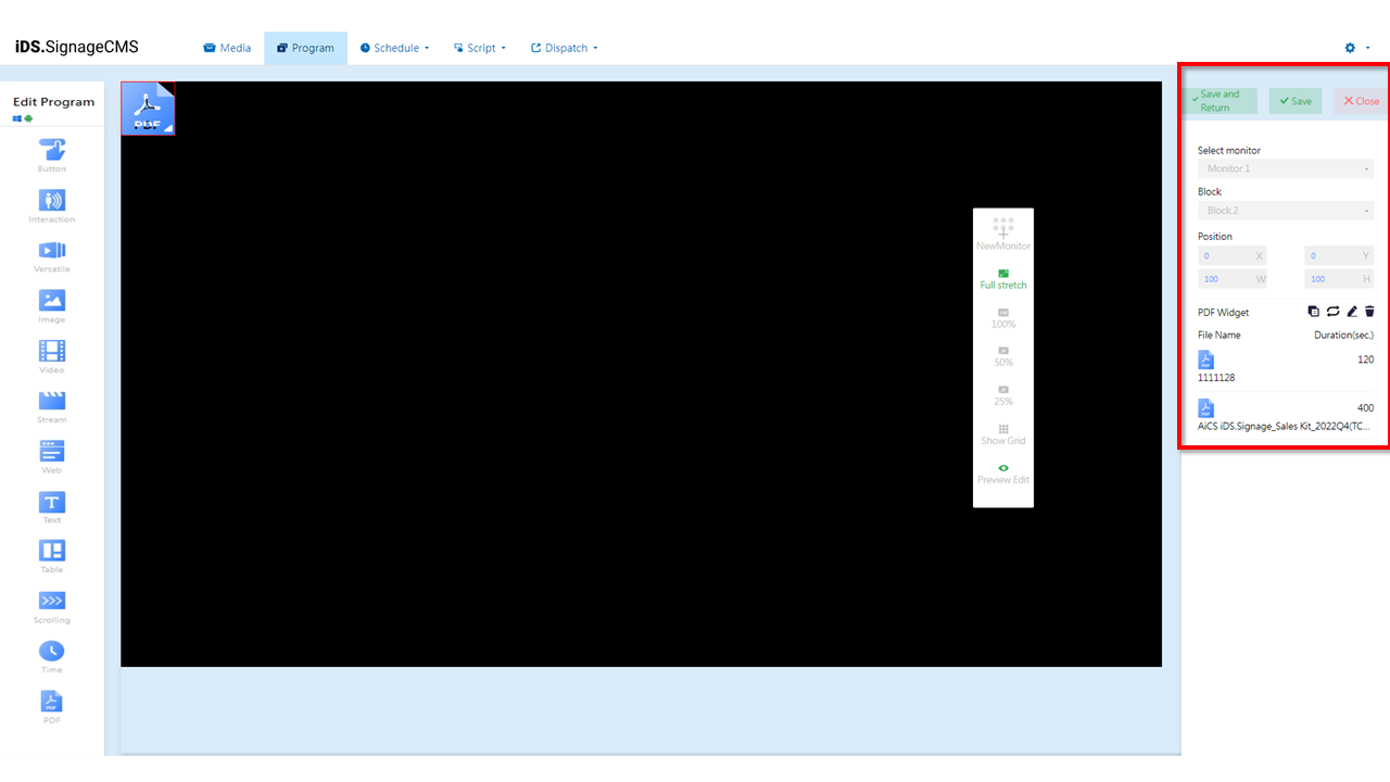
- Select monitor: If multiple screens are available, you can choose the placement areas for each screen.
- Block: The currently selected block.
- Position: You can adjust the position and dimensions of the selected area as needed.
- PDF Widger: Offers copying, playback options (sequential loop or random), editing, and deletion functions.
- Copy: You can duplicate the selected component. The duplicated component will have the same dimensions and content as the original section/component, and its position will be at the top-left corner with coordinates (X=0, Y=0).
- Playback Mode: Offers options for sequential loop or random playback. Clicking on the icon can toggle between sequential and random playback.
- Edit: Clicking on this option allows you to enter the editing page.
- Delete: You need to first select the component and then click on the delete option to remove the component.
- File Name: Displays the name of the imported file.
- Duration (sec.): Displays the playback duration of the file.
PPT Widget
Main Functionality: In the component editing widget, after selecting the PPT Widget, the following are the main functionalities of that component:
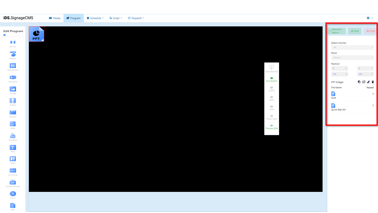
- Select monitor: If multiple screens are available, you can choose the placement areas for each screen.
- Block: The currently selected block.
- Position: You can adjust the position and dimensions of the selected area as needed.
- PPT Widget: Offers copying, playback options (sequential loop or random), editing, and deletion functions.
- Copy: You can duplicate the selected component. The duplicated component will have the same dimensions and content as the original section/component, and its position will be at the top-left corner with coordinates (X=0, Y=0).
- Playback Mode: Offers options for sequential loop or random playback. Clicking on the icon can toggle between sequential and random playback.
- Edit: Clicking on this option allows you to enter the editing page.
- Delete: You need to first select the component and then click on the delete option to remove the component.
- File Name: Displays the name of the imported file.
- Repeat: Displays the playback count of the file.
> Note: >- This feature is only supported by Windows Media Player. >- You need to have Microsoft Office software installed in the player to use this feature.
Bulletin Board Widget
Main Functionality: In the component editing widget, after selecting the Bulletin Board Widget, the following are the main functionalities of that component:
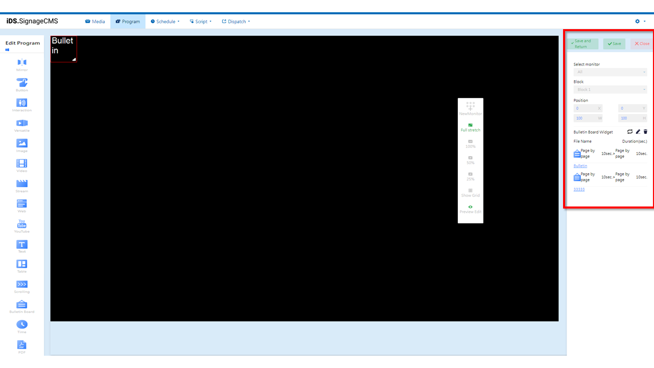
- Select monitor: If multiple screens are available, you can choose the placement areas for each screen.
- Block: The currently selected block.
- Position: You can adjust the position and dimensions of the selected area as needed.
- Bulletin Board Widget: Provides playback options (sequential loop or random), editing, and deletion functions.
- Playback Mode: Provides the choice between sequential loop and random playback. Clicking on the icon switches to random playback mode.
- Edit: Clicking this option takes you to the editing page.
- Delete: Select the component first, then click to delete it.
- File Name: Displays the imported name and processing method.
- Duration (seconds): Displays the time/movement speed for page switching in the file.
> Note: This functionality is only supported by the Windows Media Player. It is limited to use with two or more screens. The mirror component supports synchronization of content playback for image and video blocks. Video blocks only support the Background or VLC video player options. When using this component, please ensure that your Windows hardware meets the necessary performance requirements.
Mirror Widget
Main Functionality: In the component editing widget, after selecting the Mirror Widget, the following are the main functionalities of that component:
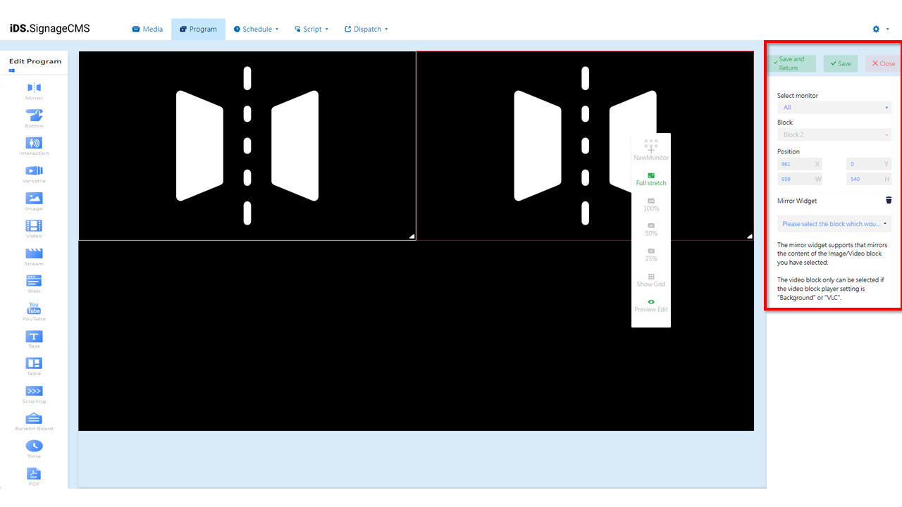
- Select monitor: If multiple screens are available, you can choose the placement areas for each screen.
- Block: The currently selected block.
- Position: You can adjust the position and dimensions of the selected area as needed.
- Mirror Widger: Allows you to choose the block to be mirrored and provides a delete function.
- Delete: To delete a component, you need to select it first and then click on the delete option.
> Note:
>- This functionality is only supported by the Windows Media Player.
>- It is limited to use with two or more screens.
>- The mirror component supports synchronization of content playback for image and video blocks. Video blocks only support the Background or VLC video player options.
>- When using this component, please ensure that your Windows hardware meets the necessary performance requirements.