Interaction Widget are exclusive to the Pro version and offer a diverse range of interaction methods, including Button Widget, interaction Widget, and Versatile Widget.
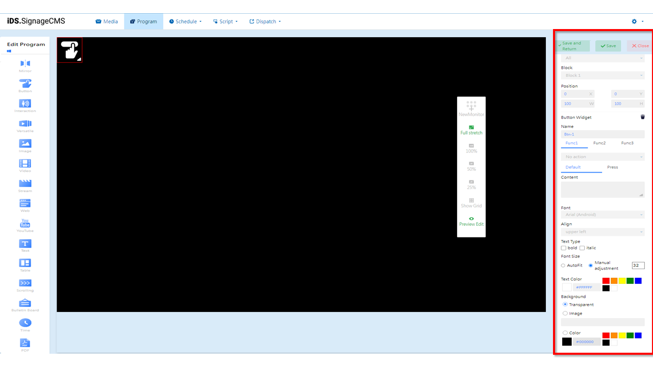
Button Widget
Main Functionality: In the component editing widget, after selecting the Button Widget, the following are the main functionalities of that component:
-
Screen Selection: If multiple screens are available, you can choose the placement areas on each screen.
-
Block: The currently selected block.
-
Position: Adjust the position and dimensions of the selected placement area as needed.
-
Button Widget: Provides a deletion function.
-
 Delete: Select the component first, then click to delete the component.
 -
Name: Set the name of the placement area. The button's behavior upon clicking can trigger actions related to Function 1, Function 2, and Function 3. Button functionality can be triggered by a single click or multiple clicks, tailored to the user's needs. The following are descriptions of the functions.
-
Function 1: Offers the following options - Do Nothing, To schedule, To previous program, To Program, To interaction playlist, To PDF previous page, To PDF next page,To stop playing, To previous media, and To next media. Item Descriptions:
- No Action: Clicking the button will result in no action.
- To schedule: Clicking the button will return to the current/default schedule.
- To previous page: Clicking the button will navigate back to the previous program.
- To Program: Clicking the button will switch to program information within the synchronized directory.
- To interaction playlist: Clicking the button will switch the content of the playback playlist.
- To PDF previous page: Clicking the button will navigate to the previous page in the PDF.
- To PDF next page: Clicking the button will navigate to the next page in the PDF.
- To stop playing: Clicking the button will stop the playback of the current media or information.
- To previous media: Clicking the button will switch to the previous media, such as an image or video.
- To next media: Clicking the button will switch to the next media, such as an image or video.
-
Function 2: Provides the following options - Do Nothing and Invoke URL.Item Descriptions:
- No Action: Clicking the button will result in no action.
- URL API: Enter a URL address. Clicking the button will call the URL and display its content in the corresponding placement area.
-
Function 3: Provides the following options - Do Nothing and Invoke Executable File.Item Descriptions:
- No Action: Clicking the button will result in no action.
- EXE PATH: Clicking the button will minimize or background the signage software and bring the executable file item to the foreground.
-
-
Button Behavior: Offers options for default settings and actions upon button press.
- Default: The appearance of the button itself, customizable based on requirements.
- Pressed: The appearance of the button after being pressed, customizable based on requirements.
-
Content: Displays the text content of the button.
-
Font: Allows customization of the font and selection of an appropriate font based on different platform players.
-
Align: Provides options for text alignment, including top left, top center, top right, middle left, center, middle right, and bottom left, bottom center, bottom right.
-
Text Type: Offers options for bold and italic styles.
-
Font Size: Provides options for automatic adjustment or manual adjustment.
-
Text Color: Allows selection of common colors, supports HEX color code input, and provides a color picker for custom colors.
-
Background: Offers options for transparency, image, and color. Colors can be selected from common options, or you can use HEX color codes or the color picker for custom colors.
Interaction Widget
Main Functionality: In the component editing widget, after selecting the Interaction Widget, the following are the main functionalities of that component:
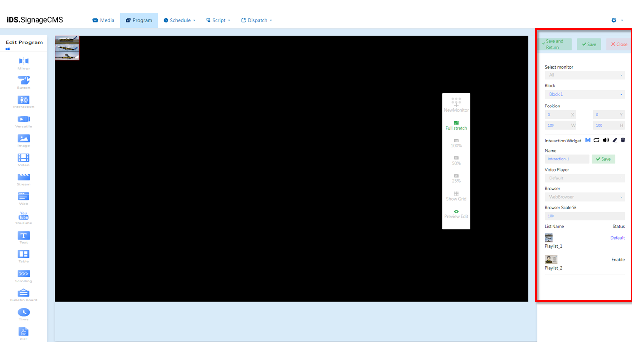
- Select monitor: If multiple screens are available, you can choose the placement areas for each screen.
- Block: The currently selected block.
- Position: Allows adjustment of the position and dimensions of the selected placement area as needed.
- Interaction Widget: Provides options for importance, playback mode (sequential or random), volume control, editing, and deletion functionality.
 Define Main Block: When multiple interactive blocks are present, defining the main interactive block is necessary for API calls.
 Playback Mode: Provides options for sequential looping or random playback. Clicking on the icon will toggle to random playback mode.
 Volume Control: You can choose whether this component should play sound.
 Edit: Clicking on this option allows you to access the editing page.
- Delete: To delete a component, you need to first select the component and then click to perform the deletion.
- Name: Allows you to set a name for the placement area.
- Video Player: Choose between Default, VLC, and Background.
- Browser: Supports WebBrowser and Chromium options.
- Browser Scale %: Provides the option to customize the display scale of web pages.
- List Name: Displays the name of the playback playlist.
- Status: Shows the status of the playback playlist, including Default and Enabled.
> Note: >- There are numerous video formats, so settings need to be adjusted accordingly based on the different formats. It's recommended to conduct thorough testing before usage to find the optimal approach. >- For video playback, we recommend using the following players: Default (K-Lite), VLC (VLC Player), or Background (K-lite) for underlying playback. >- If you need to use a browser to call the player for video playback, it's advised to use WebBrowser (Internet Explorer) or the Chromium plugin. >- Please note that the aforementioned options are supported only on the Windows operating system.