Image Widget
Main Functionality: In the component widget, after selecting the Image Widget, the following are the main functionalities of that component:
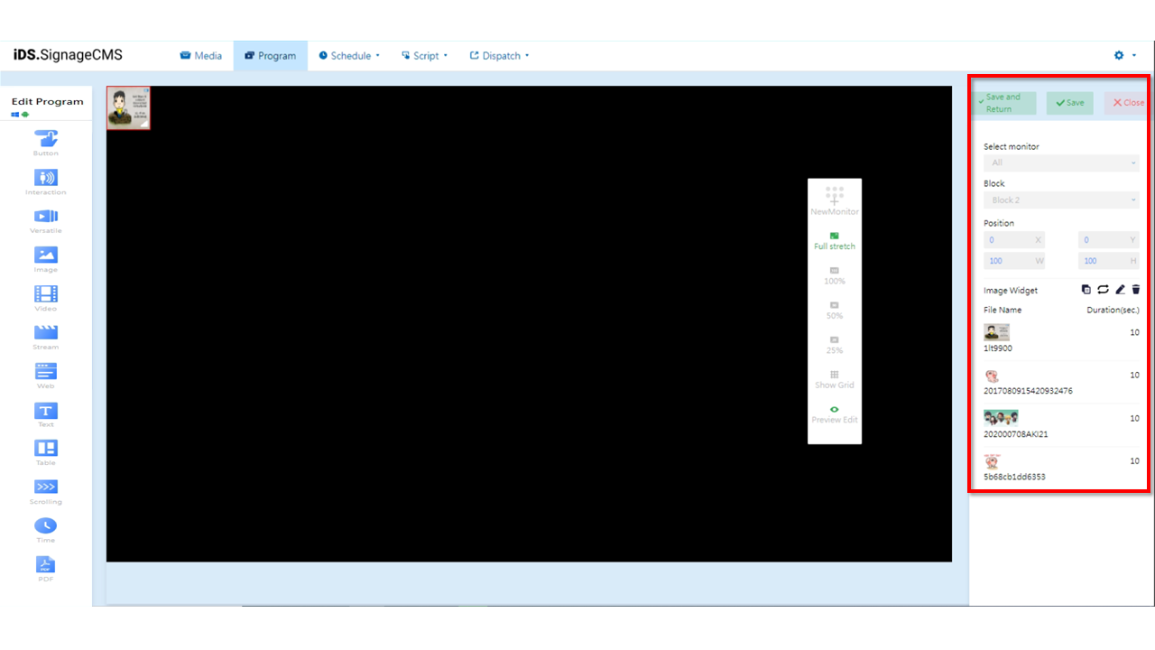
- Select monitor: If multiple screens are available, you can choose the placement areas for each screen.
- Block: The currently selected block.
- Position: You can adjust the position and dimensions of the selected area as needed.
- Image Widget: Provides functions for copying, playback mode (sequential loop or random), editing, and deletion.
 Copy: You can copy the selected component. The copied component will have the same dimensions and content as the original section/component, and its position will be at the top-left corner with coordinates (X=0, Y=0).
 Playback Mode: You can choose between sequential loop or random playback for the selection. Clicking on the icon can toggle between sequential loop and "random playback" represented by
  .
. Edit: Clicking on this option will allow you to enter the editing page.
 Delete: You need to first select the component and then click on the delete option to remove the component.
- File Name: The imported file's name and thumbnail.
- Duration(sec.): The playback duration of the file.
Video Widget
Main Functionality: In the component widget, after selecting the Video Widget, the following are the main functionalities of that component:
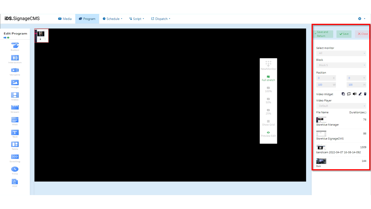
- Select monitor: If multiple screens are available, you can choose the placement areas for each screen.
- Block: The currently selected block.
- Position: You can adjust the position and dimensions of the selected area as needed.
- Video Widget: Provides functions for copying, playback mode (sequential loop or random), volume control, editing, and deletion.
- Copy: You can copy the selected component. The copied component will have the same dimensions and content as the original section/component, and its position will be at the top-left corner with coordinates (X=0, Y=0).
- Playback Mode: You can choose between sequential loop or random playback for the selection. Clicking on the icon can toggle between sequential loop and "random playback" represented by .
 Volume Control: You can choose whether this component should play sound or not.
- Edit: Clicking on this option will allow you to enter the editing page.
- Delete: You need to first select the component and then click on the delete option to remove the component.
- Video Player: You can choose from Default, VLC, and Background options. When using the marquee component, select Background for proper display.
- File Name: Displays the imported file's name and thumbnail.
- Duration(sec.): Displays the playback duration of the file.
>Note: >* The option to select a player is only available for Windows devices. >* Due to the variety of video formats, thorough testing is required for different formats to identify the optimal configuration. >* The Default player uses K-Lite Codec, the VLC player uses VLC Player, and the Background player also uses K-lite. >* For the SignageCMS Windows player to function properly and play multimedia files correctly while running the digital signage software, it's necessary to install both K-Lite Codec and VLC Player.
Streaming Widget
Main Functionality: In the component widget, after selecting the Stream Widget, the following are the main functionalities of that component:
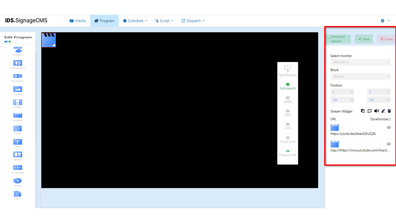
- Select Screen: If multiple screens have been added, users can choose the sections where components need to be placed on each screen.
- Section: The currently selected section.
- Position: You can adjust the position and dimensions of the selected section according to your needs.
- Stream Component: Provides functions for copying, playback mode (sequential loop or random), volume control, editing, and deletion.
- Copy: You can copy the selected component. The copied component will have the same dimensions and content as the original section/component, and its position will be at the top-left corner with coordinates (X=0, Y=0).
- Playback Mode: You can choose between sequential loop or random playback for the selection. Clicking on the icon can toggle between sequential loop and "random playback" represented by .
- Volume Control: You can choose whether this component should play sound or not.
- Edit: Clicking on this option will allow you to enter the editing page.
- Delete: You need to first select the component and then click on the delete option to remove the component.
- URL: Displays the imported streaming URL and thumbnail.
- Duration(sec.): Displays the playback duration of the streaming content.
> Note: >* Supports only RTSP streaming. >* On Android devices, RTSP streaming links that require a username and password are not supported.
YouTube Widget
Main Functionality: In the component widget, after selecting the YouTube Widget, the following are the main functionalities of that component:
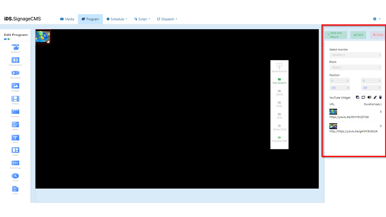
- Select monitor: If multiple screens are available, you can choose the placement areas for each screen.
- Block: The currently selected block.
- Position: You can adjust the position and dimensions of the selected area as needed.
- YouTube Widget: Provides functions for copying, playback mode (sequential loop or random), volume control, editing, and deletion.
- Copy: You can copy the selected component. The copied component will have the same dimensions and content as the original section/component, and its position will be at the top-left corner with coordinates (X=0, Y=0).
- Playback Mode: You can choose between sequential loop or random playback for the selection. Clicking on the icon can toggle between sequential loop and "random playback" represented by .
- Volume: You can choose whether this component should play sound or not.
- Edit: Clicking on this option will allow you to enter the editing page.
- Delete: You need to first select the component and then click on the delete option to remove the component.
- URL: Displays the imported URL name and thumbnail.
- Duration(sec.): Displays the playback duration of the video.
> Note: >- To comply with YouTube policies, not all links are playable. >- To ensure that the program can play correctly, please complete the program's production first and then distribute it to the player for testing.
Versatile Widget
Main Functionality: In the component editing widget, after selecting the Versatile Widget, the following are the main functionalities of that component:
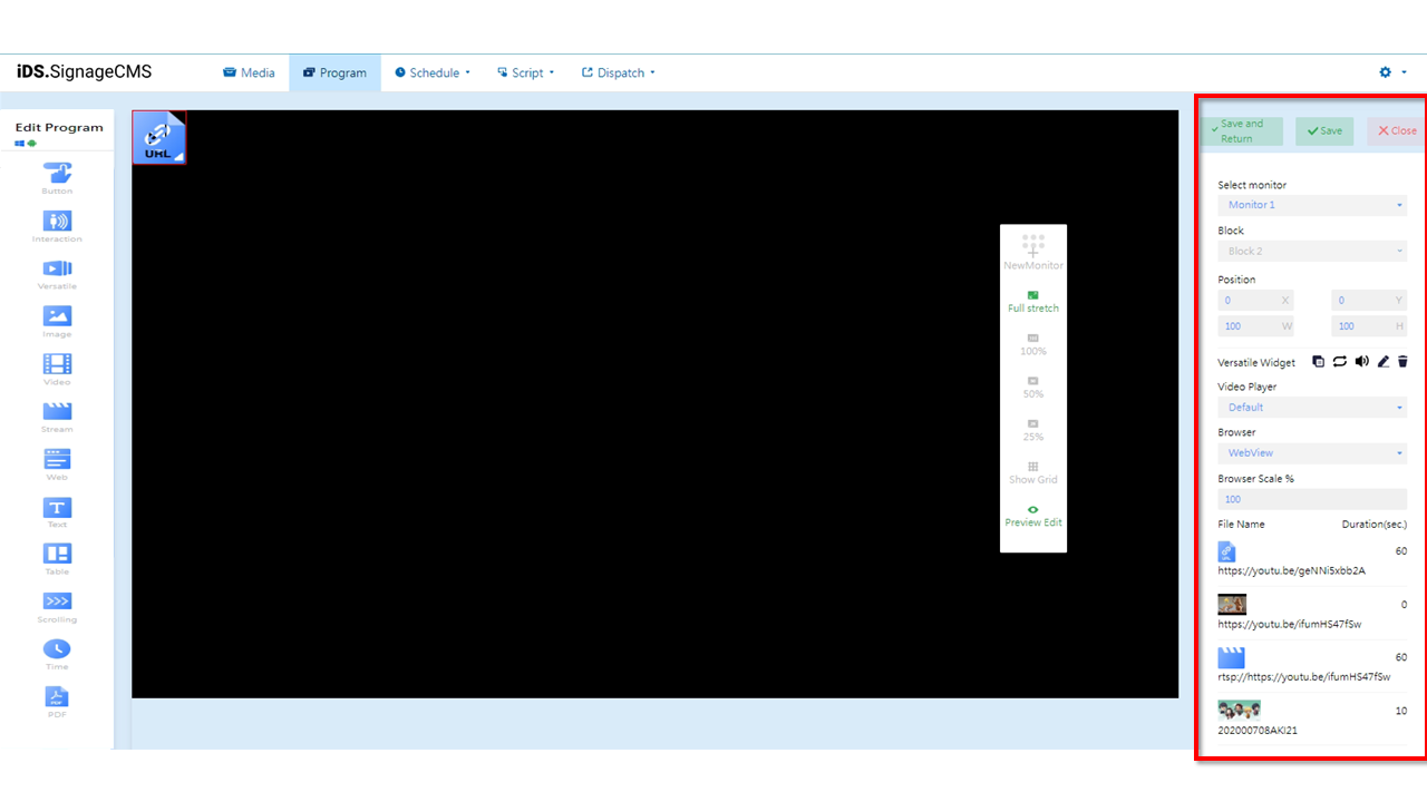
- Select monitor: If multiple screens are available, you can choose the placement areas for each screen.
- Block: The currently selected block.
- Position: You can adjust the position and dimensions of the selected area as needed.
- Versatile Widget: Provides functions for copying, playback mode (sequential loop or random), volume control, editing, and deletion.
- Copy: You can copy the selected component. The copied component will have the same dimensions and content as the original section/component, and its position will be at the top-left corner with coordinates (X=0, Y=0).
- Playback Mode: You can choose between sequential loop or random playback for the selection. Clicking on the icon can toggle between sequential loop and "random playback" represented by .
- Volume: You can choose whether this component should play sound or not.
- Edit: Clicking on this option will allow you to enter the editing page.
- Delete: You need to first select the component and then click on the delete option to remove the component.
- Video Player: There are three options available: Default, VLC, and Background.
- Browser: You can choose between WebBrowser and Chromium, both of which are supported.
- Browser Scale %: Provides the option to customize the display ratio for web pages.
- File Name: The imported file’s name and thumbnail.
- URL: Displays the imported URL name and thumbnail.
- Duration(sec.): Displays the playback duration of the content. > Note: >- Due to the various video formats, appropriate settings are required for each format. Prior to usage, thorough testing is necessary to determine the optimal configuration. >- When playing videos, we recommend using the following players: Default (K-Lite), VLC (VLC Player), or Background (K-lite) for underlying playback. >- If you need to call the player to play videos through a browser, we suggest using the WebBrowser (Internet Explorer) or Chromium plugin. >- Please note that the above options are only supported on the Windows operating system.
Web Widget
Main Functionality: In the component editing widget, after selecting the Web Widget, the following are the main functionalities of that component:
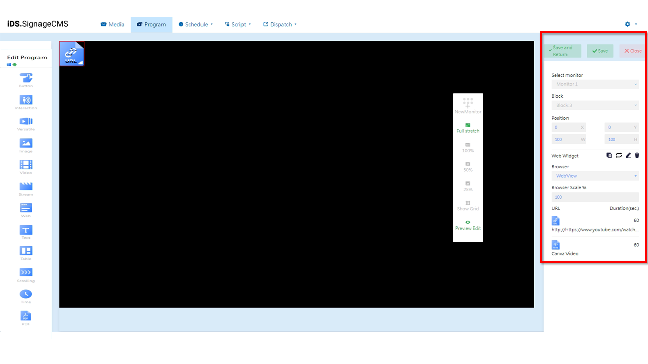
- Select monitor: If multiple screens are available, you can choose the placement areas for each screen.
- Block: The currently selected block.
- Position: You can adjust the position and dimensions of the selected area as needed.
- Web Widget: Provides functions for copying, playback mode (sequential loop or random), editing, and deletion.
- Copy: You can copy the selected component. The copied component will have the same dimensions and content as the original section/component, and its position will be at the top-left corner with coordinates (X=0, Y=0).
- Playback Mode: You can choose between sequential loop or random playback for the selection. Clicking on the icon can toggle between sequential loop and "random playback" represented by .
- Edit: Clicking on this option will allow you to enter the editing page.
- Delete: You need to first select the component and then click on the delete option to remove the component.
- Browser: You can choose between WebBrowser and Chromium, both of which are supported.
- Browser Scale %: Provides the option to customize the display ratio for web pages.
- URL: Displays the imported URL name and thumbnail.
- Duration(sec.): Displays the playback duration of the content.
> Note: >- With the multitude of video formats available, it's necessary to configure accordingly based on different formats. Before use, thorough testing is required to identify the optimal solution. >- If you need to call the player to play videos through a browser, we recommend using the Chromium plugin. >- Web Widget doesn't support pop-up page. >- Please note that the above options are only supported on the Windows version of the player.