Statistics Overview
The statistics overview provides various statistics to help users gain deeper insights into customer traffic and sales performance. These statistics cover key metrics such as total revenue, number of transactions, number of visitors, and average transaction value on a daily, weekly, monthly, and yearly basis. With these statistics, users can quickly review the operational status of each branch and optimize business operations based on data trends. Additionally, Counting BI offers multi-dimensional data filtering and comparison features, allowing users to more accurately analyze performance differences across different periods or regions, providing a solid foundation for decision-making.
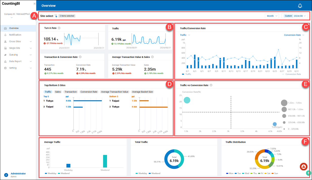 A.【Site Select】 ⇒ Click the filter
 ![]() icon to set filtering conditions based on country, region, site region, site type, or site. This can be combined with daily, weekly, monthly, or yearly time periods to display statistical data.
icon to set filtering conditions based on country, region, site region, site type, or site. This can be combined with daily, weekly, monthly, or yearly time periods to display statistical data.
B.【Operational Indicators】 ⇒ Four key operational indicators are provided. These charts not only visually present critical metrics but also help users quickly compare data changes across different periods, providing a basis for decision-making.
- Entrance Rate: This chart shows the ratio of the number of customers entering the store to the total number of people passing by the store, allowing you to understand the effectiveness of attracting customers. By comparing data from two periods, you can easily observe trends in the entrance rate.
- Number of Visitors: This chart displays the number of customers entering the store daily or weekly, helping you assess changes in foot traffic. By comparing two periods, you can quickly identify peak or declining times for customer traffic and adjust your strategies accordingly.
- Transaction Count and Conversion Rate: This chart shows the actual number of completed transactions and the conversion rate of visitors to customers, giving you insights into customer purchasing behavior. The period comparison feature aids in evaluating the effectiveness of sales strategies.
- Average Transaction Value and Revenue: This chart provides data on the average spending per customer and total revenue. By comparing changes in revenue and average transaction value across two periods, you can analyze the impact of promotional activities or market conditions on sales.
C.【Customer Traffic/Sales Statistical Comparison】 ⇒ You can choose two different metrics to compare, such as the number of visitors and revenue, and present these data comparisons using line charts and bar charts. The line chart displays the changing trends in the number of visitors, helping you understand daily or weekly fluctuations in customer traffic. The bar chart shows the specific revenue figures, allowing you to grasp the overall sales performance. By comparing these two metrics, you can intuitively understand the relationship between visitor numbers and revenue, thereby assessing the impact of foot traffic on sales income. This comparison method enables users to quickly gain insights into the interrelationships between different indicators, facilitating more targeted analysis and decision-making.
D.【Top Five/Bottom Five Sites】 ⇒ You can present the best and worst five sites based on six statistical indicators. The provided indicators include "Traffic," "Sales," "Transaction," "Conversion Rate," "Average Transaction Value," and "Average Basket Size."
E.【Visitor Data Distribution by Site】 ⇒ This bubble chart visually represents the distribution of visitor numbers and revenue across different stores. Each bubble represents a store, with the size and position of the bubble reflecting the visitor numbers and other related indicators for that store. On the right side of the chart, users can click on the "Revenue Distribution" bubble to switch to a view of the conversion rate distribution for each store, allowing for a quick understanding of how different stores perform in terms of revenue and conversion rates, and enabling deeper data analysis.
F.【Customer Traffic Statistical Indicators】 ⇒ Three types of customer traffic distribution statistical charts are provided, as described below:
- Average Customer Traffic Ratio Chart: This bar chart displays the average customer traffic comparison between weekdays and weekends, helping users quickly understand the traffic trends during these two time periods, enabling managers to grasp the differences between peak and low traffic periods.
- Total Customer Traffic Ratio Chart: The pie chart shows the total customer traffic distribution for weekdays and weekends, presenting the overall traffic volume proportion during different time periods in an intuitive manner, facilitating the evaluation of customer contributions on weekdays and weekends.
- Weekly Customer Traffic Distribution Chart: This pie chart illustrates the distribution of customer traffic from Monday to Sunday, clearly showing the traffic ratio for each day, allowing users to grasp the weekly traffic variations for more precise operational planning.